Preparing your business for global expansion entails much more than merely translating your product document and marketing materials. To maximize the probability of successful international growth, localization is what all business owners should concern about, and one of the most vital elements of the process is tailoring the online presence and website layout to their new audiences. Recently, the digital world has witnessed a wide range of website localization examples from big brands, let’s see how they adapt their site for particular markets!
Nescafé
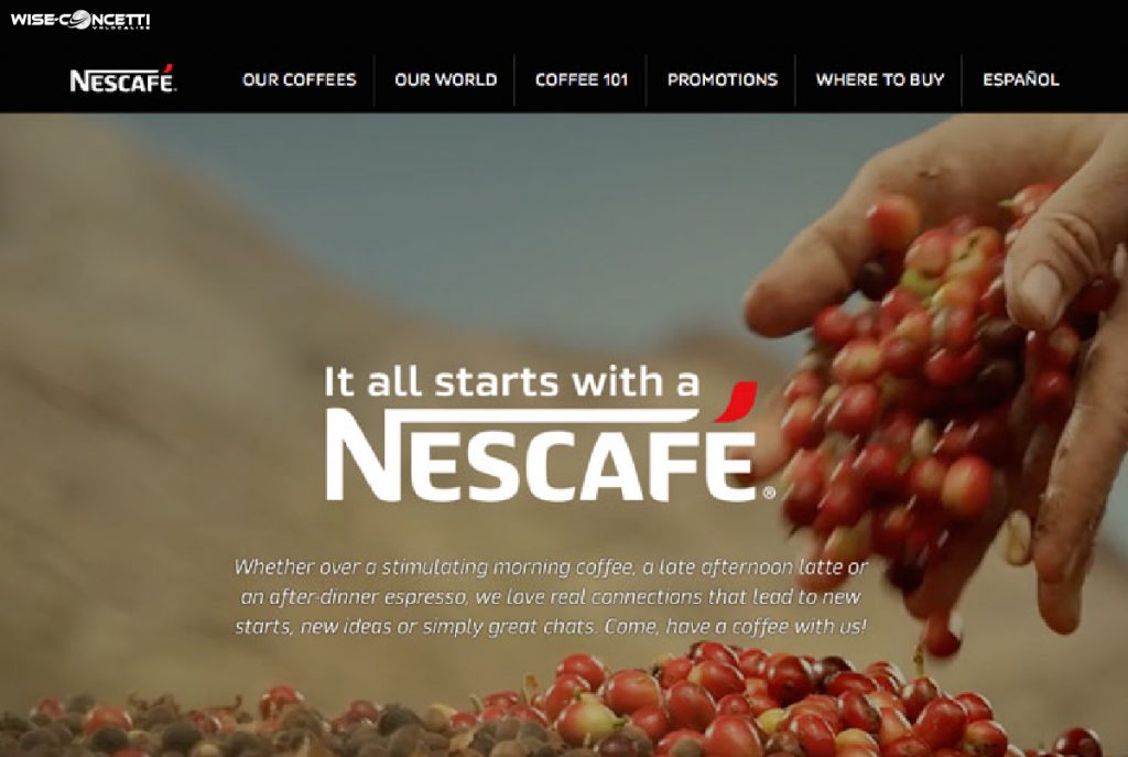
Although the awareness of localization has been more popular among companies, there are merely a few brands that have produced as many individual layouts and designs for specific markets as Nescafé. Not only providing readers with information in their mother languages, the brand has also gone the extra mile to understand the complex differences between each market to optimize the impact on each target audience.
Take a look at the US market, the home page exposed with a static logo, and a few lines of meaningful message, which was tailored towards Western concepts. In the same frame, a video presented in the background following the increasing trend of video marketing across the States.

The Japanese Nescafé site’s layout is entirely different from its US peer. Notable for a more modular layout, the site simply exhibits the images in the shape of the small logo’s detail with interesting descriptions along. Nescafé’s parent company Nesle’s logo is also in the header, which is more popular among Japanese audiences.

Coca Cola
Although the brand has made several translation pitfalls in the past, it stably improved and is well-known as the world’s best brand that attains most of its sales (around 80%) from outside the US. Understanding the importance of localization, their website is available for 118 countries and provides 45 different languages in total.
Similar to the Nescafé website for the US market, Coca Cola also has a clean layout with a straightforward message interpreted in a few texts. They also present the streamlined information in six

In contrast, the web layout changes remarkably for its Japanese version. Visitors will greet a typical Japanese style such as multiple small images, dense-block texts, and an overstuffed appearance. You may think this is a poor and unprofessional design for such a huge brand, you may want to reconsider as the Japanese prefer to know more about product information before any purchase decision.

The India website also presents in a completely different way. You will encounter image slideshows, marketing efforts such as Coke Studio India and various local products on top of the page. The brand also integrates the colors of the Indian flag as Indian has a strong sense of national identity.
Nike
As one of the most popular athletic brands in the world, it’s not surprising that Nike can maintain its reputation and high market share without altering the overall design of the website in multiple versions. However, when it comes to sensitive national elements, Nike has a dedicated adjustment to match the demand and interest of local audiences.
On closer inspection to the Nike Brazil website a few years ago, which highlighted an image of the Euro 2016 winning team, Portugal, along with some translated text from the main US counterpart. The team also appeared on almost every other version of its website.

However, this did not happen with the France website version despite the fact that they’re the host of Euro 2016. Why? As the runners up of the tournament, it’s possible that the French audience will want to stay far away from any celebrating image of their defeat, and of course, a giant like Nike will certainly want to avoid any provocation in this market. This interesting case of website localization examples pointed out that adding more language to the site without considering the layout could terribly damage brand image and reputation.

WWF
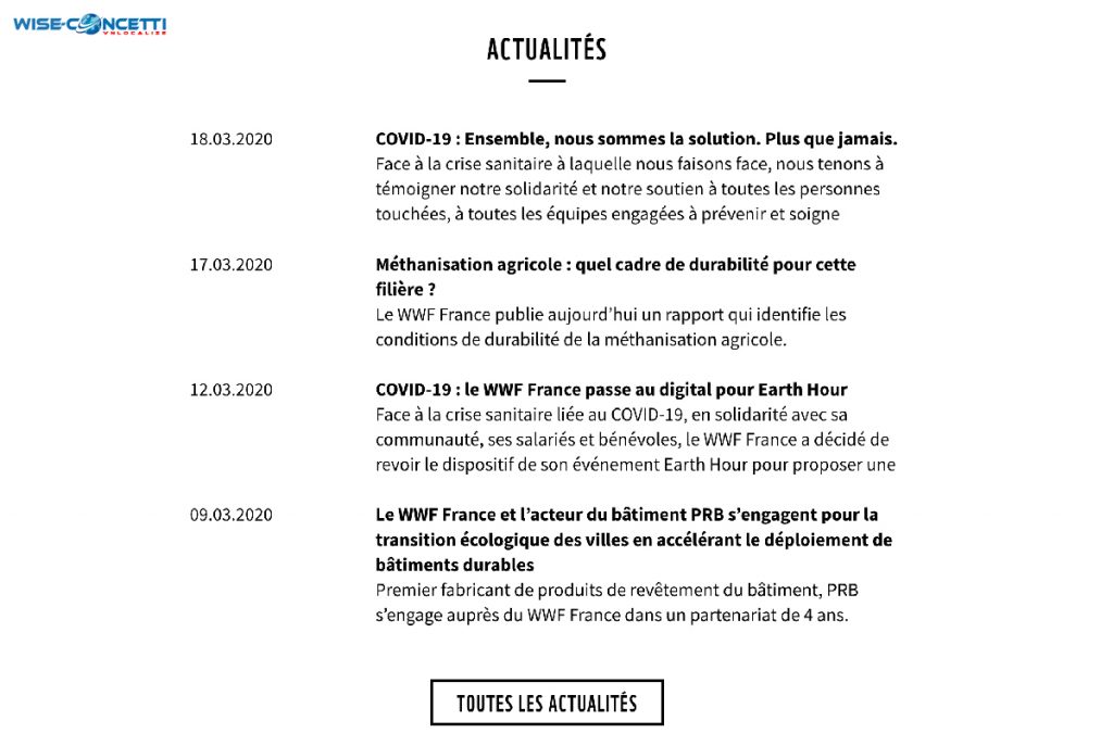
The World Wide Fund for Nature (WWF) has been in the conservation field since 1960 to protect endangered species and habitats. They’re a practical example of how we can power activism through information as well as how localization can promote these awareness campaigns. As the main touchpoint with the general public, WWF’s website acts as their digital footprint to popularize awareness by offering relevant recent studies, news, reports, etc involved in conservation to the locals.

To draw the attention of viewers around the world, the organization has spared no effort into not merely translating their content but also catering the right and relevant information to the right users. Entering the US site you may encounter a new study on the declining monarch butterfly population while a fresh post about Earth Hour is just available on the Spanish page.

After inquiring about website localization examples, you may notice that the idea about having a consistent brand principle across the world is no longer a growth strategy to international companies. Also, there is no definitive answer regarding developing a perfect website localization process in new markets, but all of the instances of giants above have affirmed that success in global markets derives from a willingness to adapt your brand to the particular culture you’re targeting.


LEAVE A REPLY